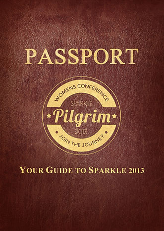
Sparkle Ladies Conference Brand 2013
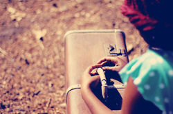
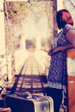
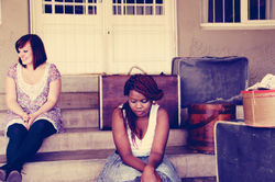
Sparkle 2014 was based on the catch phrase "Pilgrim" which was inspire by the scripture "Blessed are those whose strength is in you, whose hearts are set on pilgrimage" Psalm 84:5. The entire conference is based around the idea of women going on a journey and was decided to have a vintage feel such as luggage at an old train station and a girl or women wanting to be a part of a great journey.
This theme of vintage journey was carried through to all the media, such as the booking tickets were designed as boarding tickets that had boarding stamps on then, and designed to copy an olden day train ticket. The invites were designed to represent luggage tags. The main logo is a copy of a stamp that could be used ontickets. having htis logo was one of the brands greatest strengths as it had the most important information that could instantly be communicated by simply placing on the design, and instead of making th e design busy as some typograph can do, it added to the feel I was going for.
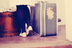
The other major strength of this brand was the photoshoot that we did in the beginning. Due to the fact that the brand concept was so solid, it was easy to stage. The photos were given a vintage color grade that was carried across to all designs, so emphasised the theme. The photos could be easily used across all media, and so made the whole process so much easier.
 |  |
|---|---|
 |  |
 |  |  |
|---|---|---|
 |  |  |
 |  |  |
 |  |  |
 |  |  |
 |  |  |
 |  |  |
 |  |  |
 |  | |
 |  |  |
| | |
|  |  |
 |  |  |
 |  |  |
 |  |  |
 | |  |
 |  |