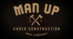
Man-Up Men's Conference Brand
The brand depicts an authentic real man working. It carries a serious tone that communicates "we mean business" but avoids an old school grungy look. The theme was "Men Under Construction" which was communicated through the photos taken of men in their various work places. The typography is inspired by retro stamps that knit together words to make a design. The typography is a powerful tool in this brand as it can easily be carried acorss to differnt deisgn that stay true to the brand but are differnt. For example, a range of pictures were taken and so differnt background collages can be made, and the brand will stay strong by merely keeping the typography in place and the colour grade must remain consistent.
Elements from the retro stamp can be isolated and used further, such as the axe and hammer, which was developed to become an emblem for the conference. In terms of a mens conference, this is a powerful concept as many men take pride in what schools they went to or what the emblem of their countries are for which they fought for in wars, and so using an emblem of unity has great strength when it especially comes to communicating to men. They take pride in being a part of something they can fight for.
 |
|---|
 |
 |